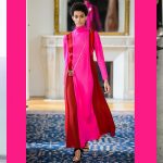
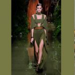
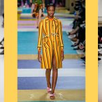
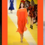
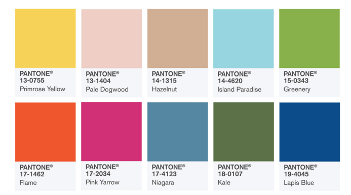
You know the see-now-buy-now trend has well and truly taken over the fashion world, when Pantone decide to release their trend trend forecast for spring 2017 just as New York Fashion Week wrapped up for another year.  Designers and consumers aren’t the only ones starting to think – and buy – less about seasons and more about perennial pieces that can be adapted teamed with more or less, depending on the time of the year. “You have to look at things and ask would people say, ‘I love that color. I want it now,’ Leatrice Eiseman, executive director of the Pantone Color Institute told Women’s Wear Daily. “For us, it also plays into that whole idea of transitional seasons and offering options that are not just typical of seasons.”
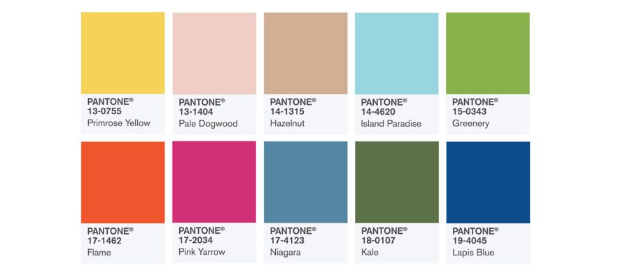
Click below and take a look at our four of our favourite shades you’re bound to start seeing in-store soon: think bold, bright and beautiful.
- Come summer popping shades of pink have often been our go-to lip colour, so we were more than pleased to see Pink Yarrow packing a punch on the runway. Want to make the ultimate summer fashion statement: try pairing Pink Yarrow with Flame and Primose Yellow. Why we’ll be wearing it: Because colours traditionally thought of as ladylike can be fierce too and no spring or summer wardrobe is complete without high-impact hues.
- Military-inspired hues of khaki have long ruled the runway, but this season the shade is underpinned with a more verdant tone of green. Why we’ll be wearing it: Because it’s versatile and season-less. Just like its sibling – more earthen hues of khaki – Kale looks as good in summer as it does over the cooler months and it’s surprisingly easy to team with a handful of colours.
- We already predicted (here and here) that vivid hues of yellow would make a comeback and we weren’t wrong. Handfuls of designers at New York fashion week sent models down the catwalk in the sunniest of shades, and London, Paris and Milan quickly followed suit. Why we’ll be wearing it: Because fashion is supposed to be fun and nothing says fun in the fashion world quite like vibrant, cheerful hues. Plus sun-kissed skin and yellow are the perfect partners in crime.Â
- We sense a trend here that we’re more than happy about: head-turning, standout shades. While head-to-toe Flame is not for the fainthearted, think Balmain and partner the fiery shade of orange with Kale. Why we’ll be wearing it: For the same reason’s we’ll be working Primrose Yellow into our wardrobe: Flame is bound to make a bold fashion statement.